
- mụcAffiliate Disclosure: This article contains affiliate links. If you start a Shopify store through these links, Bliseco may earn a small commission at no additional cost to you. This helps us continue developing high-performance themes.

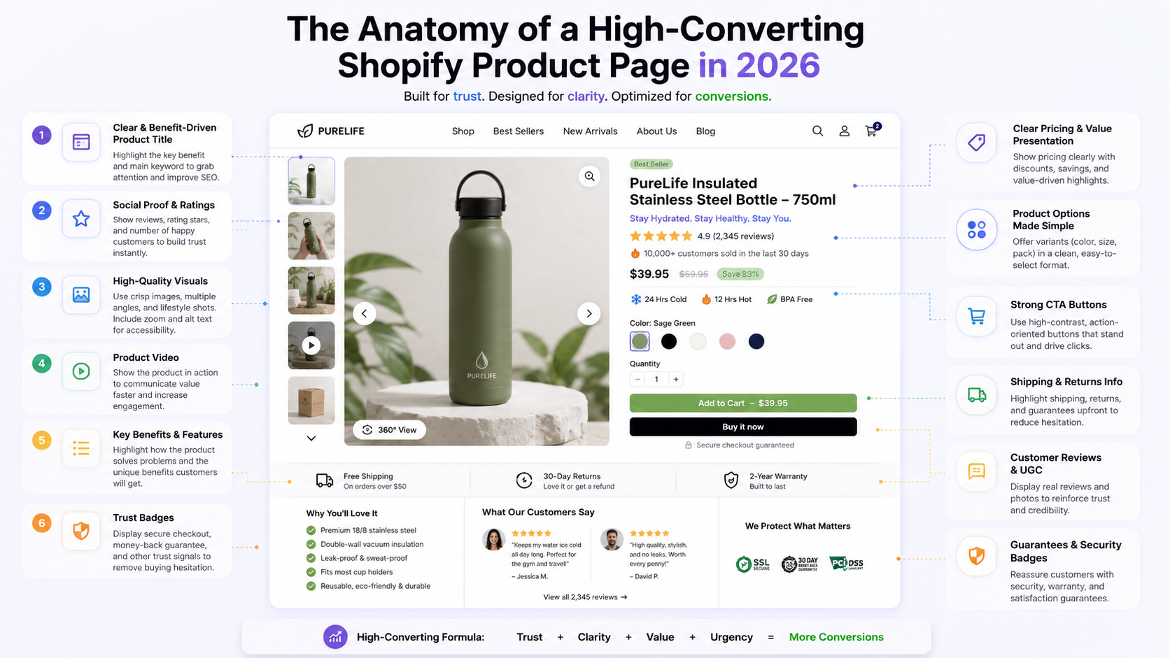
You can have the best Facebook Ads strategy in the world, a massive email list, and viral TikTok campaigns. But if your traffic lands on a poorly designed Product Detail Page (PDP), you are simply burning money.
In 2026, the modern consumer's attention span is shorter than ever. A successful Shopify product page is no longer just a digital catalog; it is a psychological funnel engineered to remove friction, build immediate trust, and force the "Add to Cart" action.
At Bliseco - Shopify Solutions, we have analyzed thousands of top-performing e-commerce stores to engineer our themes. Here is the ultimate anatomy of a high-converting Shopify product page today.
1. Obsessing Over the "Above the Fold" Experience
When a user clicks your ad on their mobile device, the first 3 seconds are critical. What they see without scrolling—the "above the fold" area—determines whether they stay or bounce.
- Instant Visuals: Product images or videos must load instantly. We achieve this by prioritizing the first media asset and lazy-loading the rest.
- Clear Hierarchy: The product title, price (with a clear comparison/discount tag), and review stars must be immediately visible.
- Whitespace: Don't clutter this area. Let the product breathe. The goal is to make the buying decision look effortless.
2. Frictionless Variant Selection (Death to Dropdowns)
Forcing mobile users to tap a tiny dropdown menu to select a size or color is a UX nightmare from 2018.
The 2026 Standard: Use visual Color Swatches and Size Buttons. Customers should be able to see all available options at a glance and select their preference with a single, comfortable tap of their thumb. If a variant is out of stock, it should be visually crossed out immediately, rather than surprising the customer with an error message after they try to add it to the cart.

3. The "Sticky" Call-to-Action (CTA)
As the customer scrolls down to read your beautifully crafted product description or check out customer reviews, the "Add to Cart" button usually disappears from view. This introduces friction. If they decide to buy, they have to scroll all the way back up.
The Fix: Implement a Sticky Add-to-Cart bar. This bar remains fixed at the bottom (or top) of the screen as the user scrolls, ensuring that the primary action you want them to take is never more than a millimeter away from their thumb.
4. Trust Signals Without the Code Bloat
Trust is the currency of e-commerce. Customers need to know their credit card data is safe and that your shipping policy is reliable.
Many merchants make the mistake of installing heavy third-party apps to display "Safe Checkout" badges or "Free Shipping" icons. This destroys your page speed (as we discussed in our previous guide).
The Native Approach: High-performance themes like ours build these trust signals natively into the code using lightweight SVGs. You get the conversion boost of security badges and guaranteed delivery timelines without sacrificing a single millisecond of load speed.
5. Optimized Mobile Descriptions (Accordions)
Long blocks of text are intimidating on a 6-inch smartphone screen. Instead of forcing users to scroll through endless paragraphs of specifications and shipping details, use Accordion (Collapsible) tabs.
This keeps the product page clean and organized, allowing users to expand only the specific information they care about, such as "Materials," "Sizing Guide," or "Return Policy."
Stop Leaving Money on the Table
Designing a product page with all these psychological and technical triggers from scratch is exhausting. Hiring a developer to custom-code sticky buttons, swatches, and lazy-loading can cost thousands of dollars.
That is exactly why we built our themes at Bliseco - Shopify Solutions. We've done the heavy lifting for you. Our themes come pre-loaded with every conversion-boosting feature mentioned above, native to the code, guaranteeing a 100/100 Lighthouse score.
🚀 Ready to upgrade your store's conversion rate? 👉 Start your new Shopify store for just $1/month using our Partner Link:
If you have an existing store and need a performance overhaul, browse our premium themes at https://bliseco.com. For enterprise or agency inquiries, reach out to our team at luche.staff@gmail.com.
Last updated: August 22, 2026